Carter Wong transforms brand identities for global B2B fisheries firm Norebo
Posted by
 Norebo has unveiled new identities for two of its sub-brands, with design by multi-disciplinary studio Carter Wong.
Norebo’s managing director for all export markets, Stephen Collyer, explains: “Norebo is a global business and we want our branding to reflect this. We want to make it clear all the business units within Norebo share the same mission and values, regardless of where they are operating in the world. Streamlining the corporate identity plays to this.”
Working in collaboration with a team of handpicked creative specialists, Carter Wong has delivered an end-to-end project, encompassing initial strategy and naming, fresh branding and a new look and feel for the Atlantika and Ocean Trawlers brands.
An authentic visual identity
Following the evolution of operations within Atlantika, Carter Wong introduced a new brand name and identity as Glacialis. The new brand now reflects the fact that harvesting extends into fishing grounds in both the North Atlantic and North Pacific oceans.
Providing premium, sustainable wild-fresh frozen at sea fish fillets to chefs, restaurants and fish & chip shops, Glacialis engages directly with the end customers. To ensure that this new identity captured the quality of the product and not only the harvesting process, Carter Wong worked with typographer Robin Clarke to help craft the main brand mark.
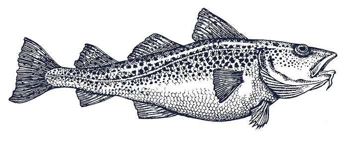
This was supported by additional illustrations by James Lewis and enhanced use of food photography, resulting in an authentic visual identity that captures the freshness and quality of the fish.
Online collateral also now focuses on the product and delves into more detail of the brand’s continued drive to cultivate sustainable fisheries. Carter Wong maintained the packaging’s premium, bold and colourful design to make it stand out from competitors.
Reflecting a broader offer
The Ocean Trawlers brand, which provides whole frozen fish and industrial blocks for industries and distributors, has been superseded by Ocean Spirit. It communicates a now broader offer, which for example now includes line-caught fish.
The new Ocean Spirit branding underlines the scale of the business, with the design of the logo suggestive of a globe and the colossal seas illustrated by Chris Mitchell. The new name, logo and brand language now evoke the wild and epic nature of the seas, with dramatic use of photography by Corey Arnold.
However, the romance of the oceans is grounded through visual call-backs to the fisheries industry itself, with the adapted typeface conjuring up connotations of the typography on the ships themselves.
Designing for a forward-looking brand
Sarah Turner, Managing Director, Carter Wong, says: “We’ve been working with Norebo for the past seven years and the company has always been open to doing things differently.
“They are one of the most forward-looking brands in fisheries in terms of technology and sustainability, and it wanted to modernise the branding of its harvesting operations to reflect its positive outlook for the industry.
“Our brand strategy for this client has always been to bring a consumer sensibility to the B2B market, differentiating Norebo’s brands from its competitors. This award-winning approach has since changed the way other companies have approached branding in the space.”
Carter Wong carried out the entire rebrand and accompanying messaging for both Atlantika and Ocean Trawlers across physical and digital channels, designing all branded elements – covering strategy, naming, messaging, logo, as well as the physical packaging, stationery, websites and video content.
Sarah Turner concludes: “We’re very proud of this project. It’s always incredibly satisfying to work with a client who isn’t afraid to be brave and take creative risks in a market that is generally quite conservative. We’re confident that this work will allow Norebo to stay ahead of the game.”


