Cowan London rethinks own label for new brand Jack’s, part of the Tesco family
Posted by
Independent, international design agency Cowan London reveals the design strategy and packaging behind the own label range for Jack’s stores.
Comprising 90 different packaging designs across multiple categories, the unique own brand range, also named Jack’s is rolling out across a number of stores over the next six months. It is not only a major piece of design work in one of the UK’s newest retailers, it also points to a new direction for value retail.
Launched in September 2018, Jack’s offers great tasting food with 8 out of 10 products grown, reared or made in Britain at the lowest possible prices to bring customers value. Cowan London was appointed as the strategic and design lead on this project, and worked collaboratively as part of a wider agency mix.
Elizabeth Finn, managing director, Cowan London, says: “Just as Jack’s is taking a different approach to value retail, we needed a new way forward for own label design. We did this using principles instead of guidelines and taking influence from the origins of the products as well as brand.”
She adds: “We created designs for individual product ranges that celebrate Jack’s three key pillars of Britishness, taste and expertise, but also show personality. Eclectic, vibrant, energetic and joyful, each one of the 90 designs aims to reassure the consumer that they are purchasing good quality products at low prices.”
British & proud
The Union Jack sits proudly across a selection of ranges – a vivid reminder not only that 8 out of 10 products are grown, reared or made in Britain, but also, of the retailer’s long-standing heritage as a value champion.
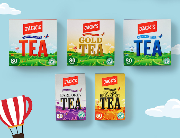
These are designs imbued with unmistakably British imagery. Dairy products feature artwork reminiscent of historic railway posters, while the tea range depicts illustrations of the British countryside, inviting the shopper to discover elements such as a hot air balloon.
On ice cream, illustrations of deck chairs and seagulls conjure a view of the British seaside, while on the range of classic puddings such as lemon fool and trifle, line drawings that transport consumers back to the lost era of the eccentric British inventor.
Instilling trust
“Shoppers look for and expect different packaging conventions in different categories,” says Finn. “When designing an entirely new range like this it’s essential to set brand and messaging within these conventions.”
A large part of how a supermarket is perceived lies in the quality of fresh produce and meat. So, alongside using transparent packaging for these ranges, subtle illustrations like hessian bags or wooden crates are also used as these speak to the idea of the market trader or family butcher, but the focus is very firmly on building trust in the product.
In the laundry range the packaging emphasises efficacy. In cereal, imagery of a bright sun rising from a bowl not only evokes a positive and familiar rise and shine feeling, but it also directs shoppers to their favourite cereal.
Proud of value
Each Jack’s product has been designed with the savvy consumer in mind to reaffirm that own brand shopping is something to be proud of.
Finn says: “A shopper-centric approach helped us navigate this substantial project and allowed us to be brave, stepping outside of traditional own brand conventions. Each range – each product, in fact – has its own personality, giving shoppers packaging that they will be proud to buy.”
Cowan London’s designs for Jack’s ready meals range use contemporary food culture to differentiate each variant. Each meal boasts its own vibrant colour palette that reflects the origin of the cuisine, reassuring shoppers on authenticity. Bold typography and tantalising photography of the meal within boosts appetite appeal and makes the range easy to navigate.
Jack’s-branded premium products are not branded as a sub-brand but are identifiable through classic cues such as, a black signifier, gold hues and highlighted special ingredients, reflecting the quality and luxury of the range – telling a great product story through type and aesthetics.
Challenging conventions
Matthew Haywood, Head of Proposition & Brand from Jack’s says: “As our strategic packaging design partner, Cowan London worked closely with us to challenge conventions in value shopping and helped us create an own brand range we are so proud of and that is inherently Jack’s. We sought to create unique and ownable designs for all our hero and sub categories – as a new brand we are different – so you will see designs that flex and mirror the individual categories they serve, giving us a truly eclectic range across the store. Providing variety, pace and personality at the shelf edge, whilst also conveying quality and value.


